This project included an iOS mobile app and an iPad app for a clinical trial testing the efficacy of a drug for a rare degenerative muscle disorder in six different countries. The objective was to collect study data electronically instead of via paper and to reduce the visits of patients to the clinics.
Designing iOS mobile app and iPad app for clinical research
Creating a more efficient way of collecting clinical study data for a rare degenerative muscle disorder
Description
iOS Apps for Conducting and Monitoring a Clinical Study
Tools Used
Sketch
Invision
Miro
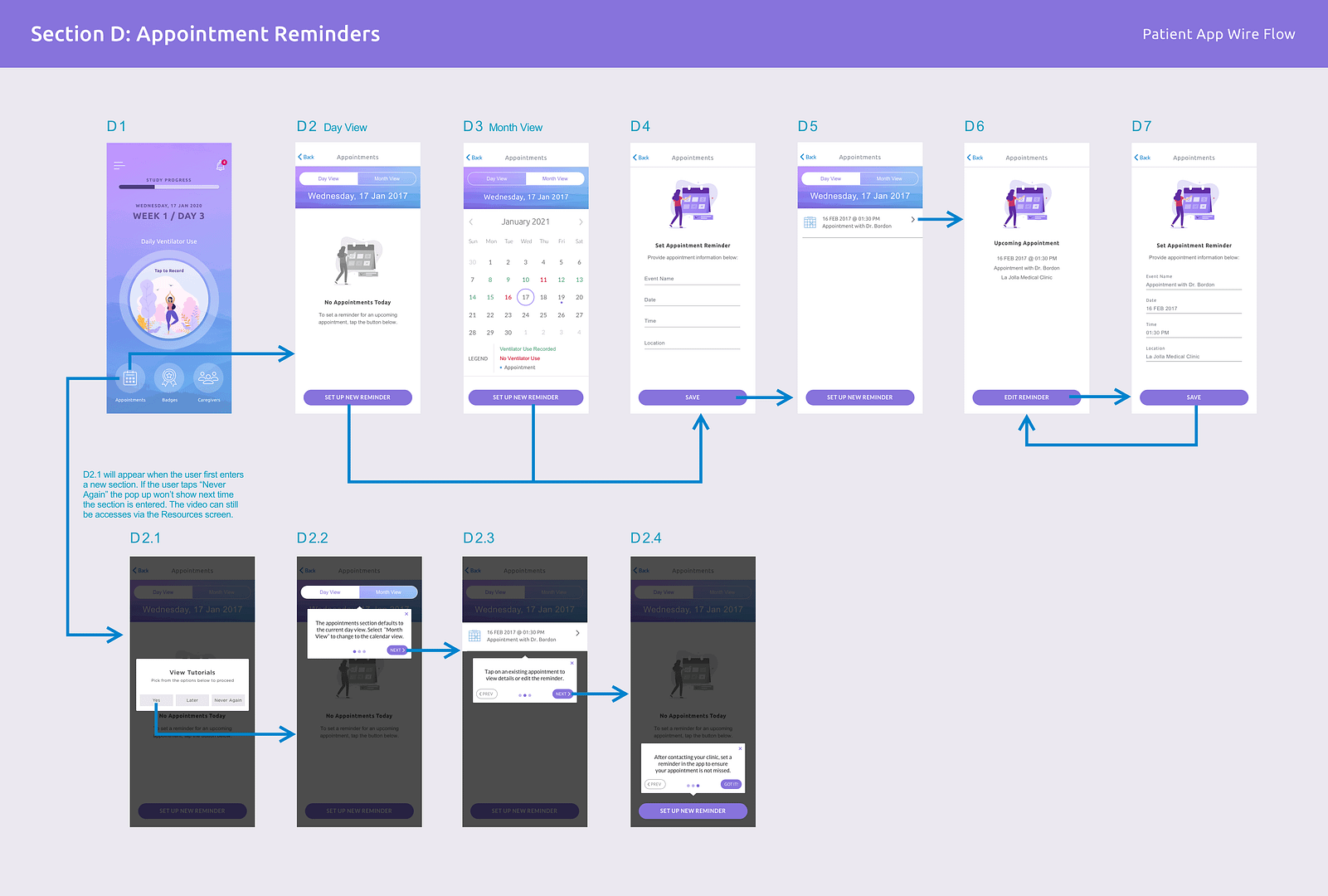
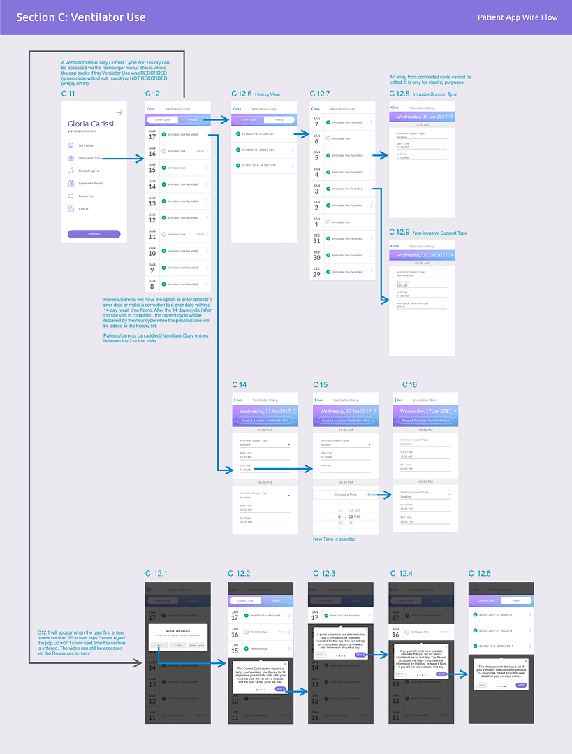
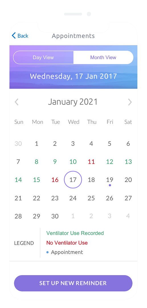
The mobile app was to serve study patients and their guardians to remotely submit daily study data, receive appointments reminders, and track their progress in the study.
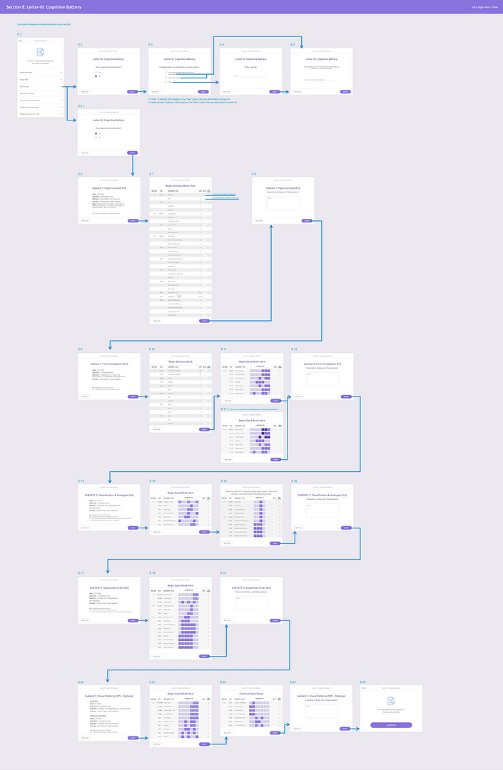
The iPad app was to serve the clinical staff to complete questionnaires with the patients, capture photos of patients’ eyelids and submit the data for review by doctors.

Research
Understanding the Needs and Goals of the End User
For this project I was assigned as the UX/UI designer and was teamed up with project managers and a team of developers. The first thing I did was to conduct interviews with the client to understand better the objective of the study.
The goal of the research was to understand what it means to live with this rare disorder, and to investigate the pain points for the clinical staff in the study procedures that need to be completed in the course of the study.
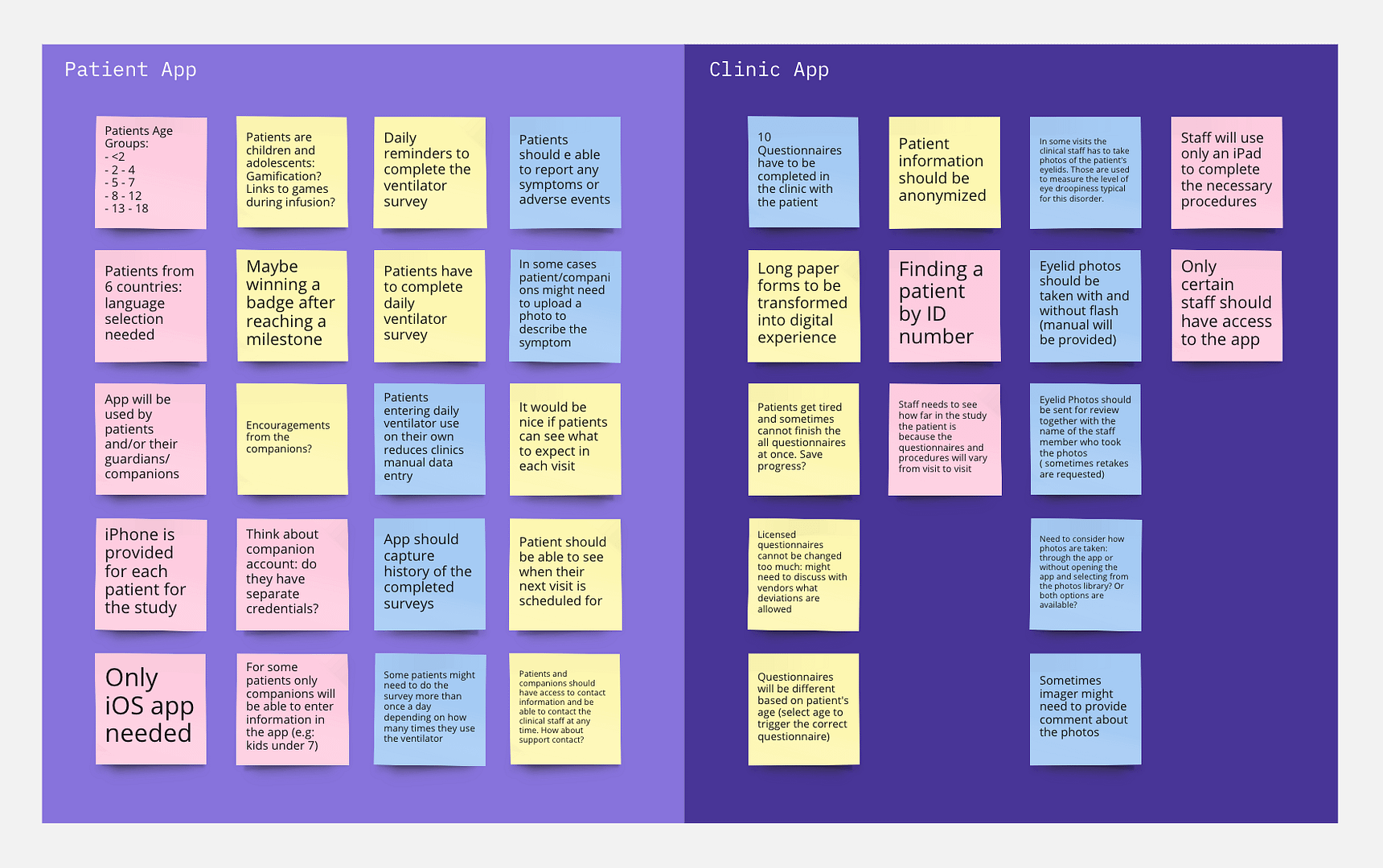
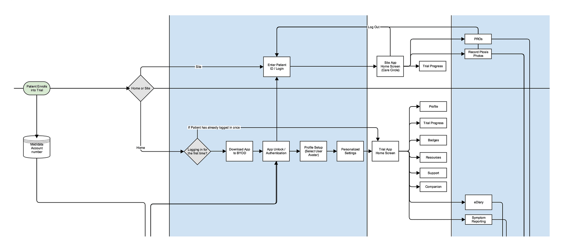
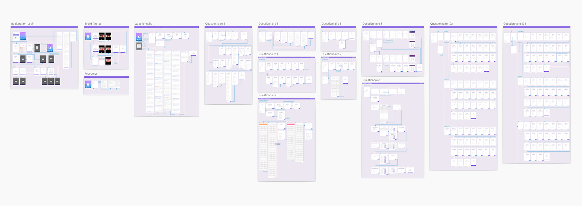
Following the research, we synthesized the findings and the business analyst wrote the functional requirements which I used to create a user flow.
These efforts established a good foundation to advance into the ideation and wires creation.
Patient App Design Decisions
Study Progress
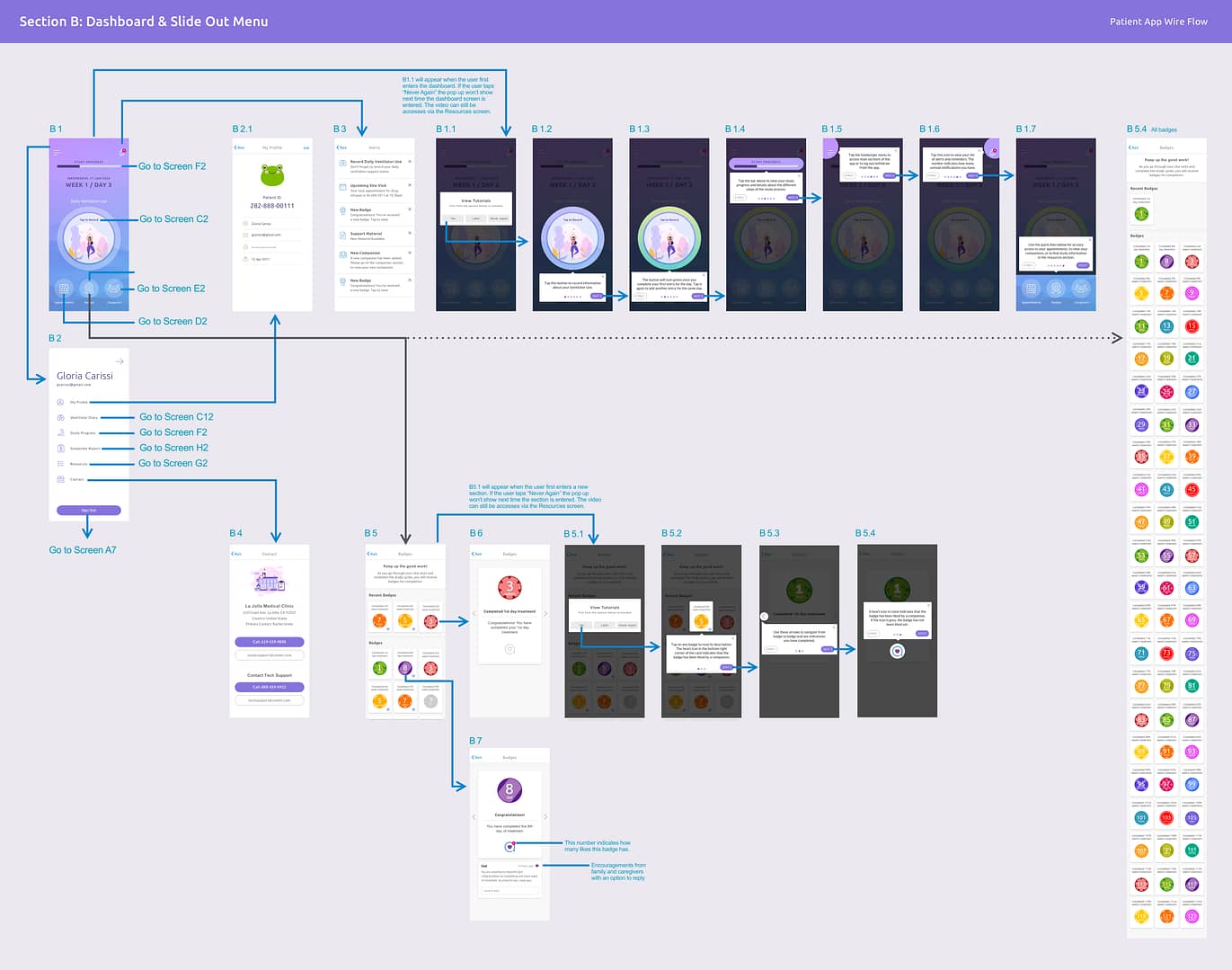
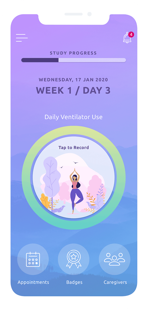
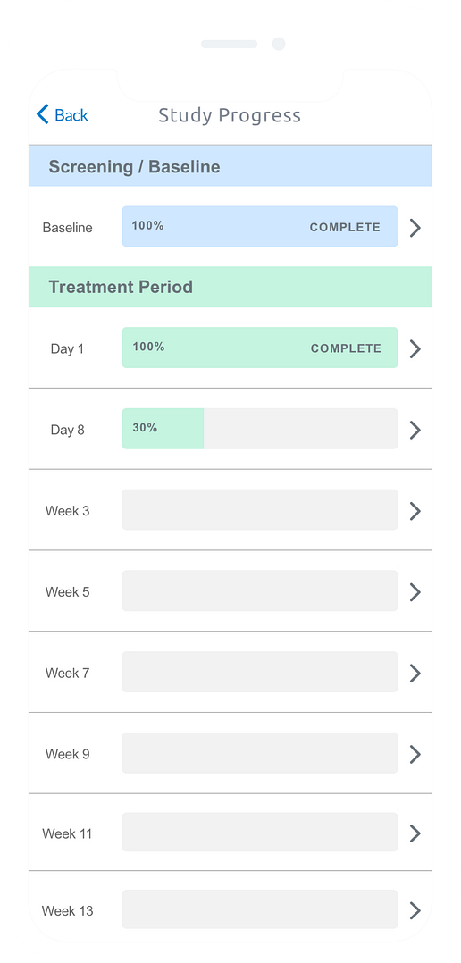
Since the study was 3 years long, a progress bar was added to the dashboard to give patients a perspective of how far in the study they are.
Calming Color Palette
The colors used in the mobile app aimed to evoke calmness and relaxation in the patients since their condition could have a negative emotional impact.
Prominent Main Action
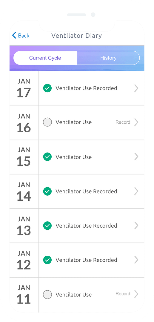
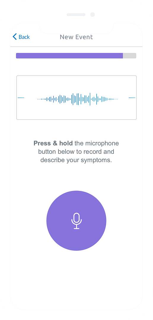
Patients with this disease often suffer from poor vision, so the action that they had to take every day was made the biggest element on the screen.
Quick Links
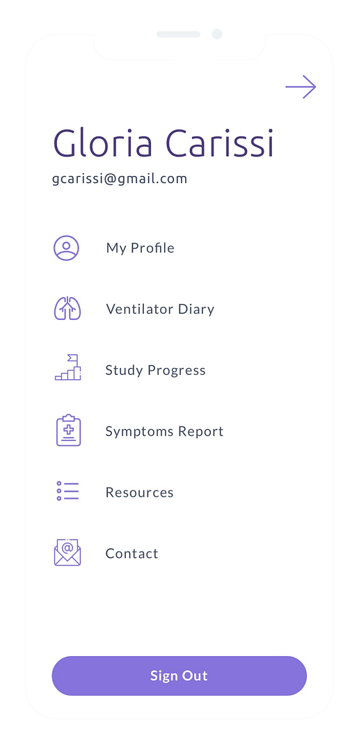
The dashboard allowed access to the more important sections of the app while less important sections could be accessed through the hamburger menu.
Fun for Children
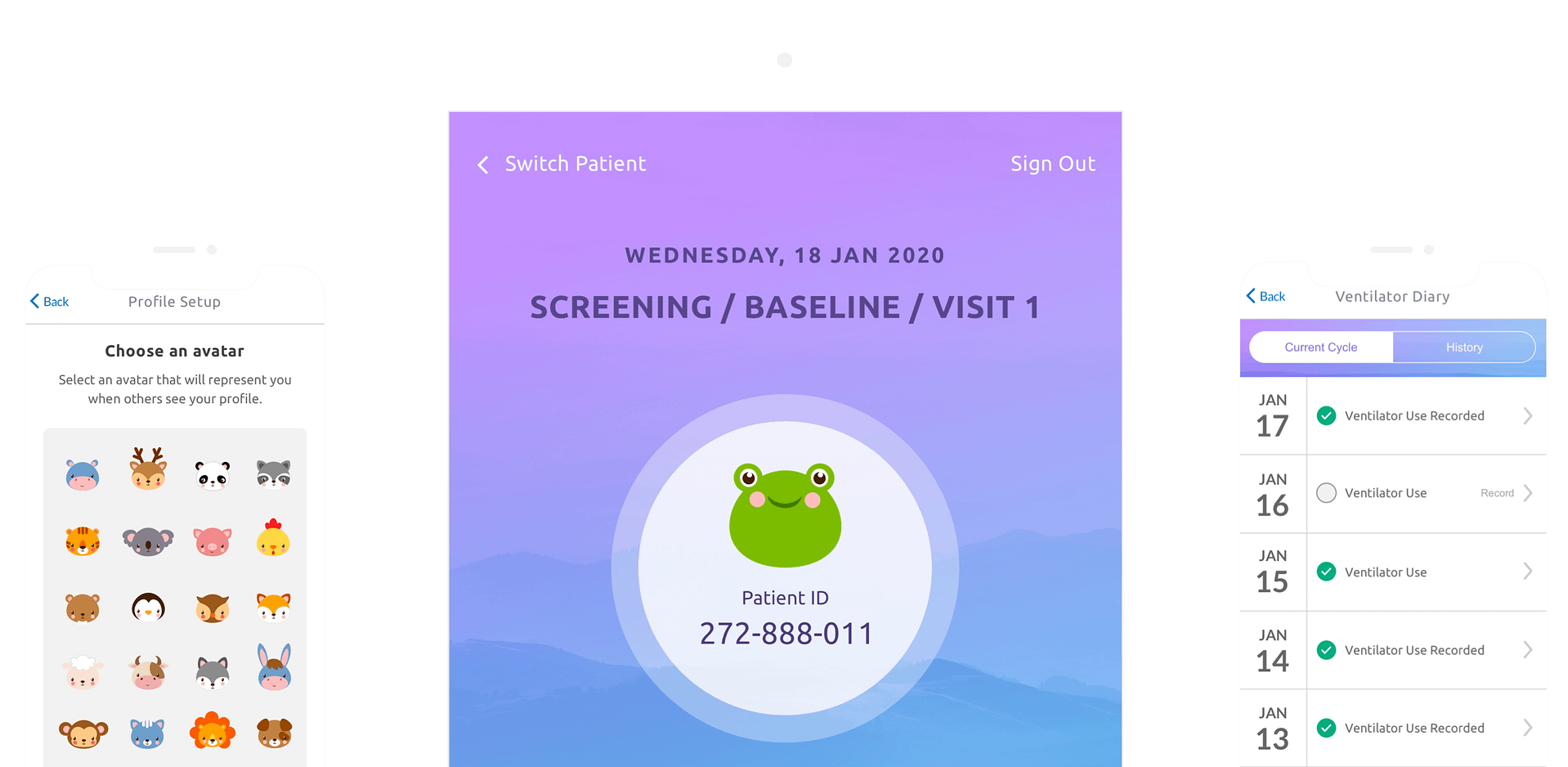
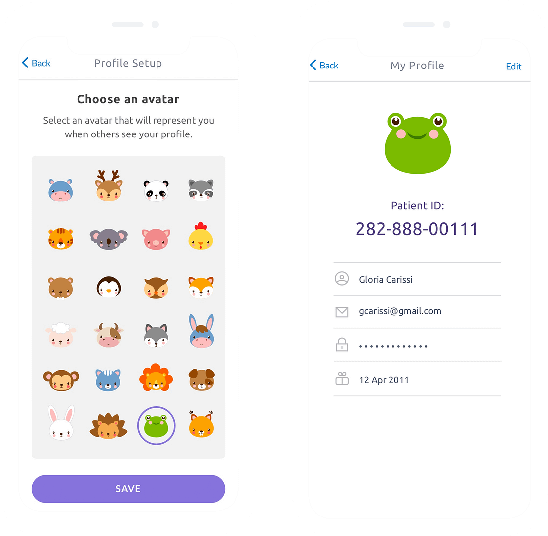
Since the patients' age group for this study was between 2 and 18 years old we decided to add a fun element for the children.
Selecting a fun animal avatar was added to the profile settings allowing the kid to be a different character every day if they wanted to.
Encouragements
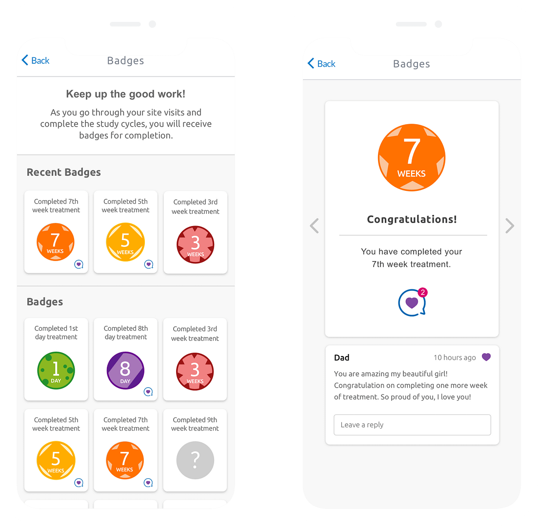
The idea of receiving badges was implemented to create a feeling of accomplishment once a treatment was completed.
Additionally, family members and caregivers can like the accomplishments and leave encouraging messages which is important for these patients.
Clinic App Design Decisions
Patients Anonymization
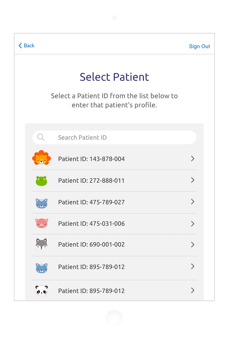
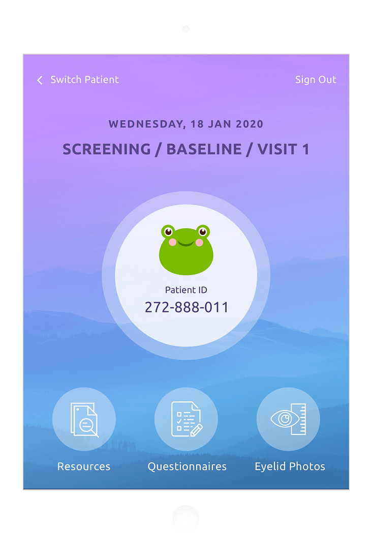
It was required that the patient's personal information is anonymized. Because of that patients were represented just by their chosen avatar and a system generated ID that the staff would use to find patients in the study.
Navigation Simplicity
The clinic app dashboard was designed to contain all actions that were needed for the clinical staff user on one single screen, so that they could quickly, easily, and efficiently complete the necessary procedures with the study patients.
Options for Photos
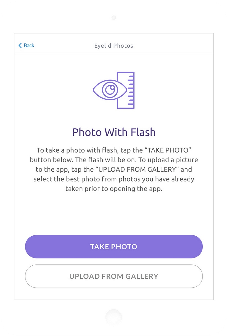
A simplified camera tool was built into the app to allow the study staff to capture patients’ eyelids with and without flash. In addition, if the photos were taken prior to opening the app, the user could upload them from the gallery.
Paper to Digital
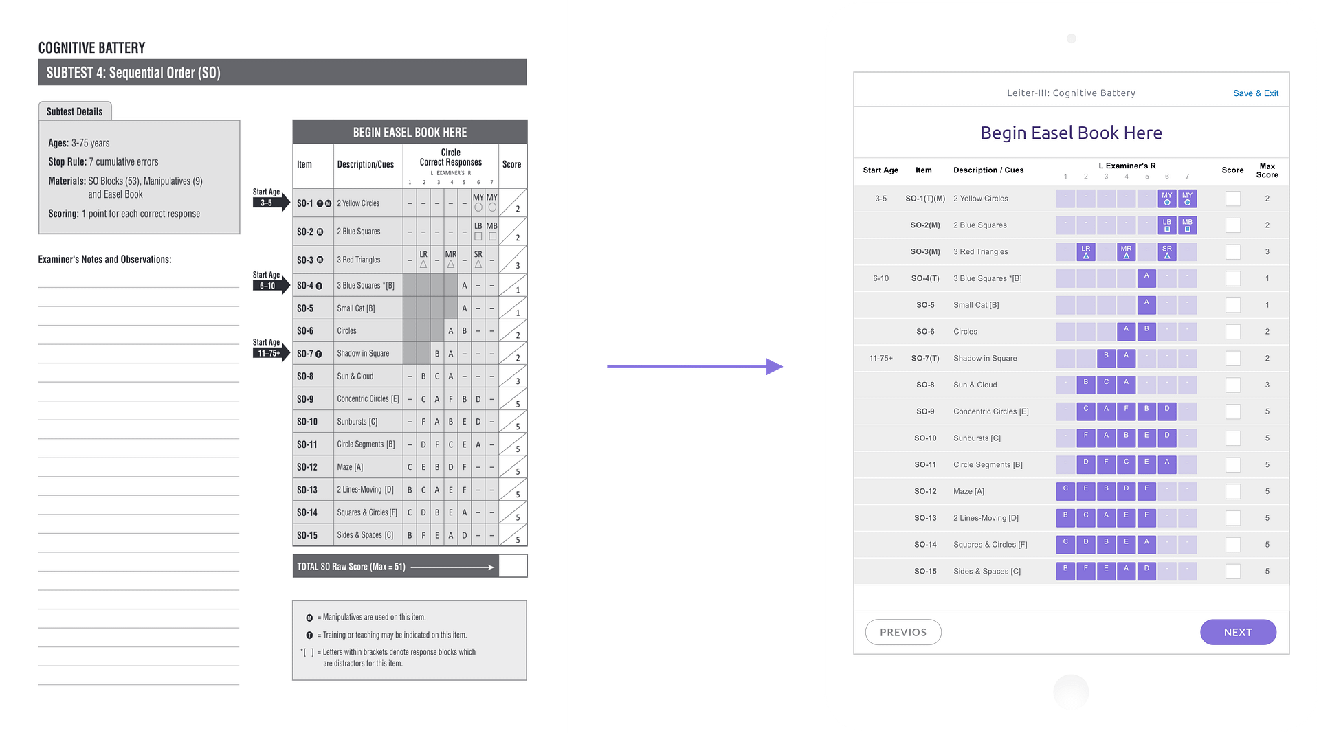
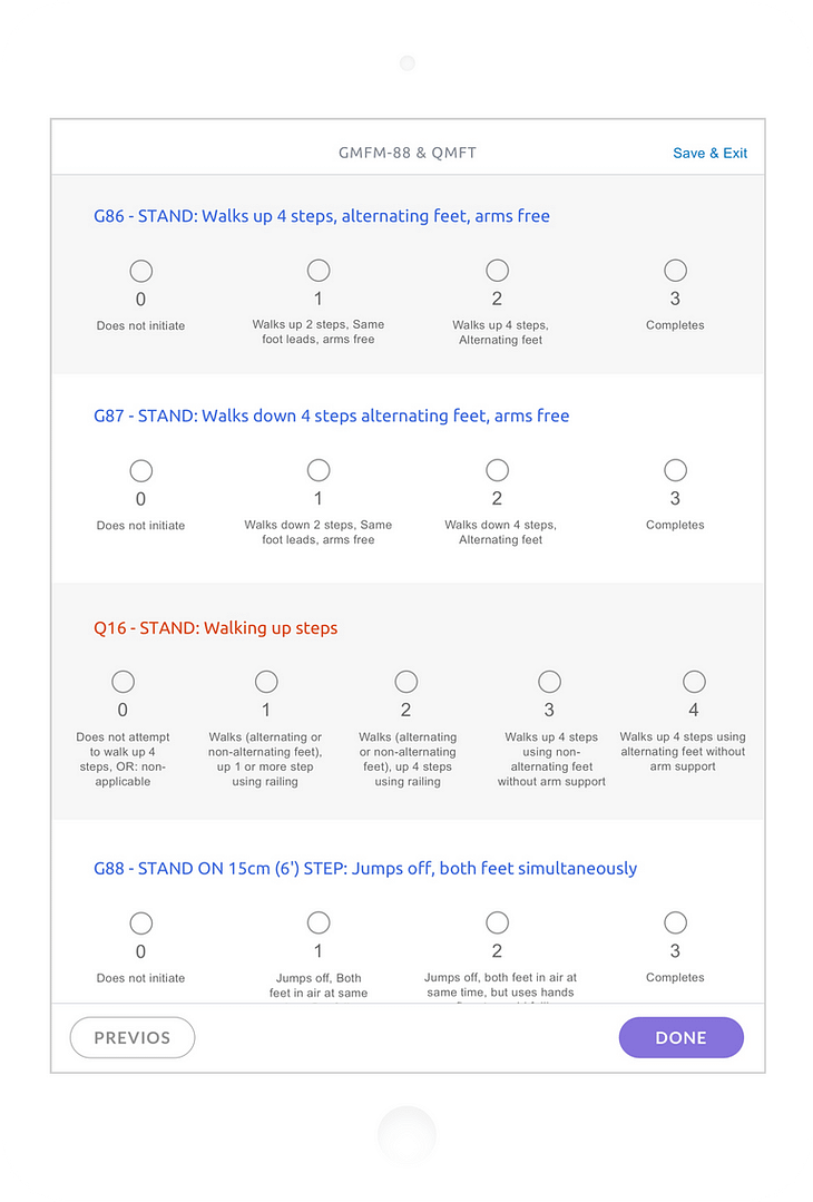
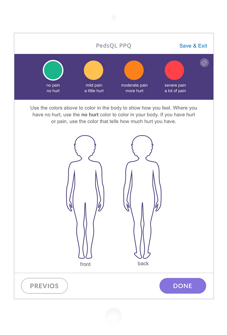
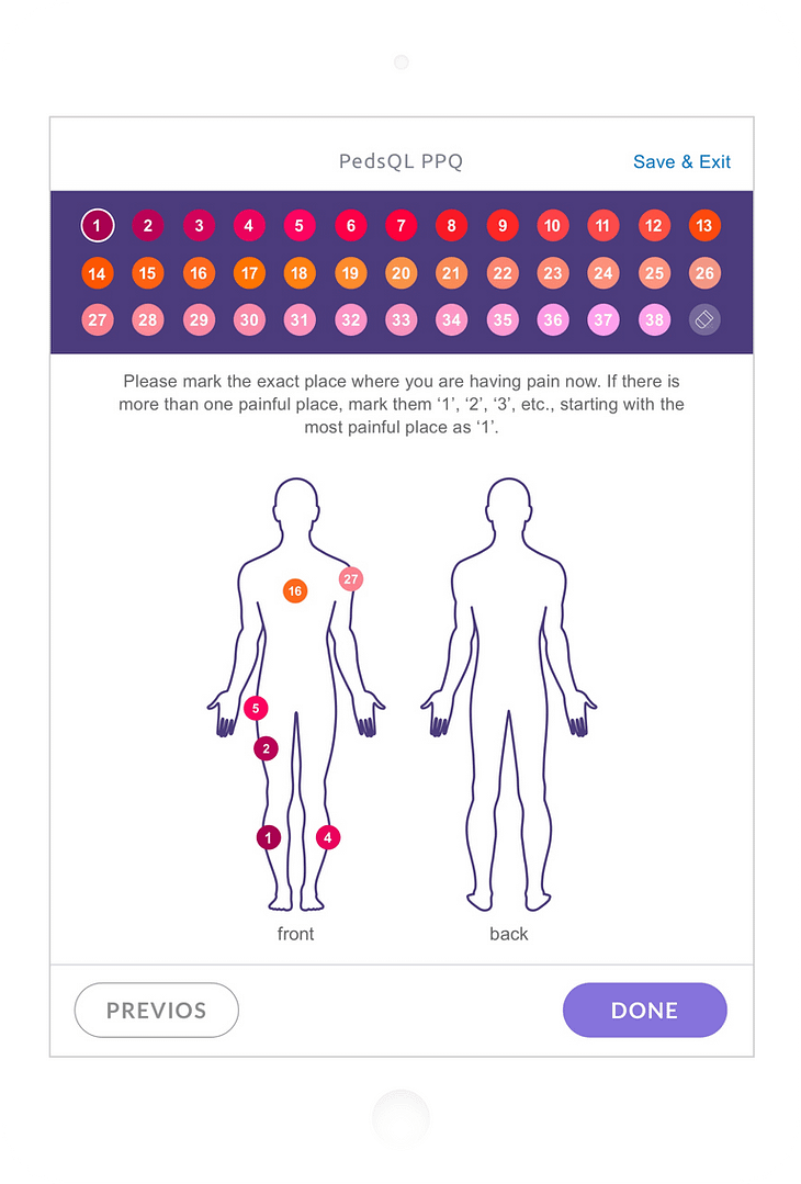
One of the biggest challenges for the clinic app was to transform long paper questionnaires into a digital experience and allow for automatic calculation of scores. There were a lot of rules provided from the vendors that created the questionnaires around how the content can be presented to the patient.
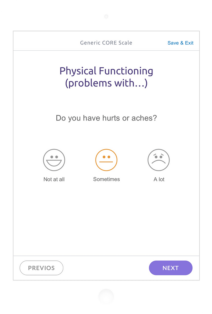
Total of 10 questionnaires were transformed from paper to digital. Each questionnaire was unique and the design challenges were different, so a tailored user experience had to be created for each one to satisfy the requirements.
Reflections & Outcomes
The Importance of Communication
Broken Requirements
Project requirements changed several times after the initial sign off. Added complexities led to challenges across all teams making the deadlines unattainable. Ultimately, there was a need for more efficient communication between the stakeholders in order to achieve a successful outcome.
Collaboration Is The Key
Seeking feedback early and collaborating with the developers were essential key components to this project. Honest conversations about the level of effort and the technical concerns that front and back end had helped me in making better design decisions in the process.
Improvement Never Stops
Changing requirements and tight deadlines made it difficult for certain features to make it into the final product. However, the initial UAT assessment was successful which led to the signing of phase 2 of the project to take care of improvements and additional requirements.
